Updates from julie Toggle Comment Threads | Keyboard Shortcuts

  • julie 3:21 pm on November 25, 2013 Permalink  

    Stephen Fortune -Database Defamiliarisation 

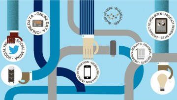
    All of these projects represent work in progress, one off speculations into our relation to database driven computational culture.

    Each one engages a particular element crucial to database culture: the relational machine of relational database management systems, the pattern seeking prerogative of data mining, and the importance of interface .

    via | Database Defamiliarisation.

     
  • julie 3:14 pm on November 25, 2013 Permalink
    Tags: behaviour   

    High-order social interactions in groups of mice 

    Social behavior in mammals is often studied in pairs under artificial conditions, yet groups may rely on more complicated social structures. Here, we use a novel system for tracking multiple animals in a rich environment to characterize the nature of group behavior and interactions, and show strongly correlated group behavior in mice. We have found that the minimal models that rely only on individual traits and pairwise correlations between animals are not enough to capture group behavior, but that models that include third-order interactions give a very accurate description of the group. These models allow us to infer social interaction maps for individual groups. Using this approach, we show that environmental complexity during adolescence affects the collective group behavior of adult mice, in particular altering the role of high-order structure. Our results provide new experimental and mathematical frameworks for studying group behavior and social interactions.

    DOI: http://dx.doi.org/10.7554/eLife.00759.001

    via High-order social interactions in groups of mice | eLife.

     
  • julie 3:13 pm on November 25, 2013 Permalink  

    Electronic skin (e-skin) presents a network of mechanically flexible sensors that can conformally wrap irregular surfaces and spatially map and quantify various stimuli1, 2, 3, 4, 5, 6, 7, 8, 9, 10, 11, 12. Previous works on e-skin have focused on the optimization of pressure sensors interfaced with an electronic readout, whereas user interfaces based on a human-readable output were not explored. Here, we report the first user-interactive e-skin that not only spatially maps the applied pressure but also provides an instantaneous visual response through a built-in active-matrix organic light-emitting diode display with red, green and blue pixels. In this system, organic light-emitting diodes (OLEDs) are turned on locally where the surface is touched, and the intensity of the emitted light quantifies the magnitude of the applied pressure. This work represents a system-on-plastic4, 13, 14, 15, 16, 17 demonstration where three distinct electronic components—thin-film transistor, pressure sensor and OLED arrays—are monolithically integrated over large areas on a single plastic substrate. The reported e-skin may find a wide range of applications in interactive input/control devices, smart wallpapers, robotics and medical/health monitoring devices.

    via User-interactive electronic skin for instantaneous pressure visualization : Nature Materials : Nature Publishing Group.

     
  • julie 3:12 pm on November 25, 2013 Permalink
    Tags:   

    Tangible Media Group.

    RADICAL ATOMS

    To address this challenge, we presented our new vision, “Radical Atoms”, in 2012. Radical Atoms takes a leap beyond Tangible Bits by assuming a hypothetical generation of materials that can change form and appearance dynamically, becoming as reconfigurable as pixels on a screen.
    Radical Atoms is a computationally transformable and reconfigurable material that is bidirectionally coupled with an underlying digital model (bits) so that dynamic changes of physical form can be reflected in digital states in real time, and vice versa.

    Radical Atoms is the future material that can transform their shape, conform to constraints, and inform the users of their affordances. Radical Atoms is a vision for the future of human-material interaction, in which all digital information has a physical manifestation so that we can interact directly with it. We no longer think of designing the interface, but rather of the interface itself as material. We may call it “Material User Interface (MUI).”

     
  • julie 3:11 pm on November 25, 2013 Permalink  

    Tribology 

    Tribology is the science and engineering of interacting surfaces in relative motion. It includes the study and application of the principles of friction, lubrication and wear. Tribology is a branch of mechanical engineering and materials science.

    via Tribology – Wikipedia, the free encyclopedia.

     
  • julie 5:04 pm on November 24, 2013 Permalink  

    Data-Driven Artists And Their Critics- Rob Myers (review) 

    – Jonas Lund ©

    Data-Driven Artists And Their Critics | http://www.furtherfield.org.

     
  • julie 5:03 pm on November 24, 2013 Permalink
    Tags: paul prudence   

    Paul Prudence – artist 

    Paul Prudence is an audio-visual performer working with algorithmic and generative environments. His work, which had beenshown and performed internationally, focuses on the ways in which sound, space and form can be cross-wired to create live-cinematic visual-music experiences. An overview of selected works can be found at here

    Limited edition digital artworks at Sedition

    Paul maintains the weblog Dataisnatureexploring the interrelationships between natural processes, computational systems and procedural-based art practices

    http://www.dataisnature.com/?p=1907 – El Lissitzky

     
  • julie 7:47 pm on November 14, 2013 Permalink
    Tags: animal communication   


    BMC Biology | Full text | Q&A: Cognitive ethology – inside the minds of other species.

     
  • julie 12:08 am on November 13, 2013 Permalink  

    Tim Schwartz 

    About.

    Tim Schwartz grew up in St. Louis, MO. He received a BA in Physics from Wesleyan University and an MFA in Visual Arts from the University of California, San Diego. In January 2010, he developed technology to help reunited missing people affected by the earthquake in Haiti and now organizes a group dealing with family reunification. In 2010, Schwartz spent four months traveling the country in a mobile research laboratory investigating what is lost as archives become digital.

    “[He] makes his playful data mashups into sculptures using retired gadgets… Like a field scientist of the information age, Schwartz filters an overwhelming amount of data through the intuitive logic of old-fashioned tools such as weather gauges, maps, and charts. Taken together, his works constitute a kind of contemporary natural history museum in which we are the subjects being examined.”

    -Lamar Clarkson, Modern Painters Magazine

     
  • julie 12:27 am on November 12, 2013 Permalink  

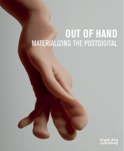
    Out of Hand: Materializing the Postdigital 


    Out of Hand: Materializing the Postdigital – we make money not art.

     
  • julie 12:10 am on November 12, 2013 Permalink  

    The Writer Automaton 

    The Writer Automaton – YouTube.


  • julie 5:39 pm on October 23, 2013 Permalink  

    THE PNEUMATICS OF HERO OF ALEXANDRIA 

    THE PNEUMATICS OF HERO OF ALEXANDRIA.

    Some of these automata descriptions from Heron (around 150BCE) are amazing. Brilliant resource.

    Also: http://history-computer.com/Dreamers/Heron.html and step back to http://history-computer.com/ for more automata history. Also great.

     
  • julie 4:48 pm on October 23, 2013 Permalink  

    Datalandia, the fictional town saved by data 

    Datalandia, the fictional town saved by data.

     
  • julie 10:48 am on October 18, 2013 Permalink  

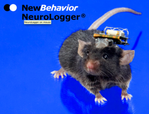
    EEG devices for mice 

    Screen Shot 2013-10-18 at 10.47.43

    NeuroLogger — Welcome to NewBehavior AG.

    Also tracking cages and other mental equipment.

     
  • julie 11:53 am on October 14, 2013 Permalink  

    Animal robots have become a unique tool for studying the behavior of their flesh-and-blood counterparts.

    via Send in the Bots | The Scientist Magazine®.


  • julie 7:27 am on October 14, 2013 Permalink  

    Amy Youngs – interactive sculptures, installations and new media art work.


  • julie 7:26 am on October 14, 2013 Permalink  

    Animals and Aesthetics 

    Evental Aesthetics |  Current Issue.

     
  • julie 12:56 pm on October 3, 2013 Permalink  

    Koblin – Data Visions – Think Insights – Google.  http://www.google.co.uk/think/articles/the-knowledge-chris-milk.html [use for refs]   This refers to Data Paint: http://www.datasciencecentral.com/profiles/blogs/the-rise-of-the-data-artist-in-business

     
  • julie 12:53 pm on October 3, 2013 Permalink  

    Online data haunts 

    The Knowledge: Simon Roger – Think Insights – Google.


  • julie 3:41 pm on October 1, 2013 Permalink
    Tags:   

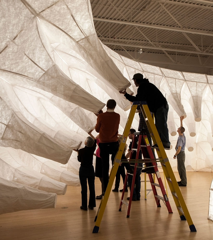
    Dielectric / Electroactive Polymers 

    ▶ Electroactive Polymers Part 1: Shower Hose Stretching Mechanism Video Tutorial – YouTube.

    Pt 2 – stretching: http://www.youtube.com/watch?v=PgNKeqOCOKE&feature=share&list=UUMq2XZHOUiR8ZBDtTeRAJQw

    ShapeShift: http://youtu.be/4XGVMXCxBNA – really great how to of architectural shapes + linking them

    Butterfly-like wings from Uni of Sydney: http://www.youtube.com/watch?v=aBAzjJwFkS0

     
  • julie 2:21 pm on September 26, 2013 Permalink
    Tags: naked mole rats   

    Entrainment (chronobiology) 

    Entrainment (chronobiology) – Wikipedia, the free encyclopedia.

    Naked Mole Rats do not have a circadian rhythm as they live subterraneanly. Would rhythmic sounds affect them? What would be the equiv of them hearing in the wild – antelopes?

     
  • julie 1:43 pm on September 26, 2013 Permalink  

    Stretching Sound to Help the Mind See by Walter Murch 

    The danger of present- day cinema is that it can suffocate its subjects by its very ability to represent them: it doesnt possess the built-in escape valves of ambiguity that painting, music, literature, radio drama and black-and-white silent film automatically have simply by virtue of their sensory incompleteness — an incompleteness that engages the imagination of the viewer as compensation for what is only evoked by the artist.

    full article  Stretching Sound to Help the Mind See by Walter Murch.

    Ambiguity in data? in movement – dynamics of sculpture?

     
  • julie 10:24 pm on September 23, 2013 Permalink  

    Prelinger Library 

    Megan Prelinger: Art, Advertising, and Outer Space – Boing Boing.

    early data representation visual at 13mins…

     
  • julie 10:20 pm on September 23, 2013 Permalink
    Tags: automata   

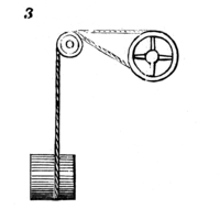
    507 Mechanical Movements 


    507 Mechanical Movements.

     
  • julie 4:59 pm on September 19, 2013 Permalink
    Tags: multiplexing   

    Multiplexing infos 

    bildr » Muxing Around With The CD74HC4067 + Arduino.

    http://www.instructables.com/id/Multiplexing-with-Arduino-and-the-74HC595/

    http://playground.arduino.cc/learning/4051

     
  • julie 5:55 pm on September 17, 2013 Permalink
    Tags: john grade   

    john grade’s capacitor moves and illuminates with weather data 

    hygroskin: a climate-responsive kinetic sculpture

    via john grade’s capacitor moves and illuminates with weather data.


  • julie 4:28 pm on September 17, 2013 Permalink  

    NMR Scanning 

    Nuclear Magnetic Resonance.


    vs Naked Mole Rat Scanning 🙂

     
  • julie 4:26 pm on September 17, 2013 Permalink
    Tags: friendchip, PIT tags   

    Friendchips 

    “the AVID brand Friendchip type is peculiar due to its encryption characteristics. The simple fact that a cryptographic feature is provided in a chip would not necessarily be unwelcome; few pet rescuers or humane societies would object to a chip design that outputs an ID number “in the clear” for anyone to read, and, in addition, has authentication features for use by scanners that know how to use them, for detection of counterfeit chips. But the “Friendchips” have been found lacking in actual authentication features, and rather easy to counterfeit well enough to fool the AVID scanner. Although there’s no authentication encryption involved, there is obfuscation encryption, meaning decryption secrets are

    needed, to convert what the chip transmits into its original label ID code.”

    via Identification Systems: Microchipping Animals.

    http://maxmicrochip.com/ – DIY scanner & code. Plus online decryption tool for Friendchips.

    http://en.wikipedia.org/wiki/Microchip_implant_(animal)

     
  • julie 4:22 pm on September 17, 2013 Permalink
    Tags:   

    Big Data report 

    Raconteur on Big-data-2013.

     
  • julie 3:54 pm on September 17, 2013 Permalink
    Tags: butterflies, nanotexture   

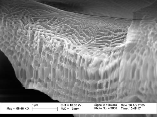
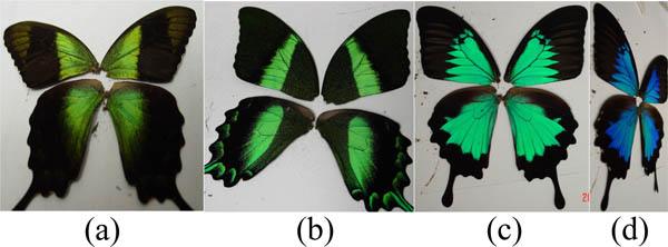
    Deciphering Butterflies’ Designer Colors 

    The Optical Society – Deciphering Butterflies’ Designer Colors: Findings Could Inspire New Hue-Changing Materials.

     
  • julie 7:05 pm on August 28, 2013 Permalink
    Tags: julie freeman   

    Digital Wave – The Independent (1998) 

    The new wave in art - Arts & Entertainment - The Independent

    The new wave in art – Arts & Entertainment – The Independent.

     
  • julie 12:24 pm on July 26, 2013 Permalink
    Tags:   

    Data visualization: ambiguity as a fellow traveler : Nature Methods : Nature Publishing Group 

    Being sure is good; being uncertain is not necessarily bad. Research teams are working to render uncertainty visual.

    via Data visualization: ambiguity as a fellow traveler : Nature Methods : Nature Publishing Group.

    The visualization platform Caleydo has a functionality called StratomeX that reveals uncertainty factors in data analysis. Shown here, different clustering algorithms used to slice through the same brain-tumor gene expression data lead to different results. Algorithms: non-negative matrix factorization method (left), consensus hierarchical clustering method (center) and consensus hierarchical clustering method after manual curation of the data (right).

    This paper looks at the uncertainty in statistical analysis and how differing results and data uncertainties can affect how we ‘read’ data.

    To do: check out consensus clustering etc.

     
  • julie 11:20 am on July 26, 2013 Permalink  

    Andreas Koller 

    UK data vis

    Portfolio – Andreas Koller.

     
  • julie 1:13 pm on July 25, 2013 Permalink
    Tags: , science   

    Databrary 

    The Databrary ProjectMost developmental scientists rely on video recordings to capture the complexity and richness of behavior. However, researchers rarely share video data, and this has impeded scientific progress. By creating the cyber-infrastructure and community to enable open video sharing, the Databrary project aims to facilitate deeper, richer, and broader understanding of behavior.The Databrary project includes:Databrary. A web-based repository for open sharing and preservation of video data and associated metadata.Datavyu. A free, open source video-coding software, that enables coding, exploring, and analyzing video data.Labnanny. A data management system that supports data-sharing within labs, among collaborators, and in the Databrary repository.The Databrary project is dedicated to transforming the culture of developmental science by building a community of researchers committed to open video data sharing, training a new generation of developmental scientists and empowering them with an unprecedented set of tools for discovery, and raising the profile of behavioral science by bolstering interest in and support for scientific research among the general public.

    via About.

     
  • julie 4:47 pm on July 23, 2013 Permalink  

    UK Data Archive – FILE FORMATS TABLE 

    FILE FORMATS TABLEThe UK Data Archive works with different data formats for different purposes. There are optimal data formats that are used for long-term preservation of data.This table contains guidance on file formats accepted by the UK Data Archive for deposited data. We welcome queries from researchers about appropriate file formats for working and preservation, particularly early in the research process.

    via UK Data Archive – FILE FORMATS TABLE.

     
  • julie 5:20 pm on July 16, 2013 Permalink  

    Historical Global Temp data sonified 

    A Song of Our Warming Planet 

    A sonification of historical average global temperature provided by NASA’s Goddard Institute of Space Studies. A solo cellist plays the temperature, simply mapped to notes. The video is overlaid with a standard graph of the temperature increasing, which  indicates that the makers felt the need to compound the sonic experience with visuals.

    I’m not keen on the work, however, the most interesting bit is at 03:34 when the titles declare that additional warming would produce notes beyond the range of human hearing [according to this mapping].

     
  • julie 6:01 pm on July 5, 2013 Permalink  

    Works of digital and Internet art, performance, installation, conceptual, and other variable media art represent some of the most compelling and significant artistic creations of our time. These works constitute a history of alternative artistic practice, but because of their ephemeral, technical, or otherwise variable natures, they also present significant obstacles to accurate documentation, access, and preservation. Without strategies for preservation many of these vital works – and possibly whole new genres such as early Internet art – will be lost to future generations. Description of and access to art collections promote new scholarship and artistic production. By developing ways to catalog and preserve these collections, we will both provide current and future generations the opportunity to learn from and be inspired by these works. It is to achieve these goals that we initiated the consortium project Archiving the Avant Garde: Documenting and Preserving Variable Media Art.

    via BAM/PFA – Archiving the Avant-Garde.

    Use for reference.

     
  • julie 5:58 pm on July 5, 2013 Permalink  

    Martin Wattenberg: Data Visualization: Art, Media, Science 

    Martin Wattenberg makes amazing work. And I like how he describes what he does – use this in paper as an explanation of viz vs art.

    My work focuses on visual explorations of culturally significant data. I’m constantly seeking new ways to represent information to create connection, insight, narrative and beauty.

    via Martin Wattenberg: Data Visualization: Art, Media, Science.

     
  • julie 3:54 pm on July 5, 2013 Permalink
    Tags: media, newspapers   

    British Newspaper Archive 

    Home | Search the archive | British Newspaper Archive.

    Useful resource for searching for word that have appeared in the press. For instance, a search for the word data showed that 21,483 articles had the word data in them from 1700-1999. Searching for the word fact pulls up 273,873 articles from same database.

    What would we find the the last 20 years?

     
  • julie 3:33 pm on July 5, 2013 Permalink
    Tags: , supervised learning, unsupervised learning   

    Unsupervised Learning 

    Unsupervised learning – Wikipedia, the free encyclopedia.

    CHAT

    J
    A  is this true Machine learning techniques that crunch through very large data sets to learn and gain ‘meaning’ from them tend to work on popularity and frequency bias.
    A
    a lot of the words there are ill defined..
    A
    popularity of what?
    A
    frequency of what?
    A
    bias towards what?
    A
    i’m also not sure you can learn ‘meaning’
    A
    also, not sure what ‘meaning’ is in this context
    J
    bias toward patterns in the data that occur frequently
    A
    what do you then mean by “to work on”?
    A
    do they “work” (as in they are useful) because they specifically “look for” patterns
    A
    often machine learning is called pattern recognition
    ]J
    but is it?
    A
    so saying that machine learning works because it recognises patterns is reasoning in circles a little bit i guess
    A
    it’s what they do, not why they work
    J
    i’m trying to assess if using ‘deep learning’ techniques will result in outliers and freaky data being dismissed
    A
    dismissed how?
    J
    not deemed important enough to highlight. in a google search for instance
    A
    i’m not sure deep learning does that, don’t know much about it
    A
    i think you probably need some more precisely defined terms to be able to say something about these algorithms
    J
    it seems to be (i’m sketchy on this) whether ML techniques are used to learn about the data without the use of ontologies, the neural nets learn what they need to learn based on the patterns they find
    A
    you should look into supervised vs. unsupervised learning
    J
    okay…
    A
    just the two terms
    J
    yes – unsupervised
    A
    supervised is when an algorithm is trained on data that is labeled, it can learn from examples, unsupervised is when the data isn’t labeled, it finds and labels patterns on its own, but they might not correspond to somebody else’s pattern->label matching
    A
    i would take ‘meaning’ out, and make it more concrete, and then specify what they do (input->output), not how they work. and specifically state unsupervised learning, not ML in general
    J
    i get that, so in unsupervised learning, when you are clustering patterns, I want to know what relevance (?) is given to the aspects of the data that don’t fit in to any cluster. Except the cluster of non-clustering things.
    J
    thank you, this is v helpful
    A
    it’s not certain that they don’t fit in any clusters
    A
    dividing a plane in half still leaves two infinite planes
    J
    that’s what i mean about the cluster of non-clustering things. there can’t be a no-cluster.
    A
    clustering algorithms take dimensions of the data into account, if they don’t take a dimension into account it doesn’t matter what it is
    A
    what are non-clustering things?
    A
    you can make a no-cluster, it’s just a cluster with the name no-cluster
    J
    so when my algorithms have run (are running), I have sets of clusters that are repeat patterns (eyes in a series of faces say). But what happens to the face with a set of freckles in the shape of Italy that only occurs once but it really quite special. How will the system learn about the specialness of unique things?
    A
    i wouldn’t call them patterns, just a cluster of data points.
    A
    a learning algorithm can only see what you give it. you’ll have to give it a dimension for freckles and a dimension for ethnicity, perhaps skin colour or hair colour. you can then ask for points that have not many similar points, but that isn’t necessarily machine learning
    A
    if you want to learn about uniqueness as a phenomenon you’ll have to start describing it and then find patterns in that i guess
    A
    unique things aren’t special
    A
    per se
    J
    yes i see that, so i guess unsupervised learning won’t necessarily do that as that would mean labeling some bits of the data (perhaps semi-supervised learning).
    J
    haha
    J
    some of them are
    A
    just point out there is a value judgement in there that machine learning just isn’t concerned with
    J
    ok, yes – loads of things for me to think about. I’ll let you get on…
     
  • julie 3:30 pm on July 5, 2013 Permalink
    Tags: materials   

    Painting materials; a short encyclopaedia http://whatsinthe.library.qmul.ac.uk/index?R=3056230400
    Artists’ pigments c. 1600-1835 : a study in English documentary sources
    http://whatsinthe.library.qmul.ac.uk/index?R=3325825024
    Methods and materials of painting of the great schools and masters.
    http://whatsinthe.library.qmul.ac.uk/index?R=2325221376 The pigments and mediums of the old masters : with a special chapter on microphotographic study of brushwork
    http://whatsinthe.library.qmul.ac.uk/index?R=3970555904

    The Industrial Revolution

     
  • julie 4:50 pm on July 4, 2013 Permalink  

    Data Art vs. Data Visualization: Why Does a Distinction Matter? [link] 

    A pretty hilarious take on data art vs data visualisation, in which the author (Stephen Few) and (most of) the commenters fail to understand what data art is (imo). I am mildly incredulous, however, as much as I don’t want to perpetuate the blog post, I really think it has value in exposing some key issues.

    And some of the comments have good points  in particular how the visual form

    and style can mask whether the data is ‘good’.

    EXCERPT:

    Two distinct approaches to presenting data graphically exist today—data visualization and data art—and rarely do the twain meet. They differ in purpose and in design. When we fail to distinguish them from one another, we not only create confusion, but do great harm as well”

    […] How in particular is data art—visualizations that strive to entertain or to create aesthetic experiences with little concern for informing—harmful when it masquerades as data visualization?

    1. It suggests that data cannot be visualized without training in the graphic arts. As such, it works against the democratization of data. In fact, anyone of reasonable intelligence and a little training can present data effectively. It’s vital that this ability spreads more broadly across the population, because it can play a role in making a better world.

    2. It features ineffective practices as exemplars of data visualization. It encourages people to present data in ways that are difficult to perceive and understand simply because they are prettier or more entertaining, which is rarely relevant to the task.

    Visual Business Intelligence – Data Art vs. Data Visualization: Why Does a Distinction Matter?.

     
  • julie 2:55 pm on July 4, 2013 Permalink
    Tags: processing   

    The Nature of Code [book] 

    The Nature of Code.

    Online book with processing code and tutorials by Daniel Shiffman from ITP. Great.

     
  • julie 12:05 pm on July 3, 2013 Permalink  

    The Art of Data – exhibition 

    Peter Hirshberg: The Art of Data. Huffington Post article

    http://theartofdata.org/artists/ Exhibition website

    LOVE the Casey Reas work: http://vimeo.com/50404575 but some of the other work is too veering on the visualisation side of data art for my personal pref. Too didactic.

    it is a purposefully programmed version of the video of my laptop dying from 2004


    Julie Freeman - My Laptop Dying (still from video) 2004

    Julie Freeman – My Laptop Dying (still from video) 2004

     
  • julie 2:43 pm on June 30, 2013 Permalink  

    Aaron Koblin: Artfully visualizing our humanity – YouTube 

    Some nice stuff at the beginning about data vis, and then veers to mechanical turk stuff.

    Aaron Koblin says data can make us more human. Can we more human? He also quotes Manovich (without citing him – weird)

    19th century culture was defined by the novel, 20th century culture by cinema, the culture of the 21st century will be defined by the interface.

    -Lev Manovich

    I would say that the 21st Century will be defined by data. Data is behind many decisions at political, social, environmental, and economic levels – essentially it shapes the world around us which permeates our culture. Without data an interface is impotent.

    Aaron Koblin: Artfully visualizing our humanity – YouTube.

     
  • julie 8:02 pm on June 29, 2013 Permalink
    Tags: , ,   

    dat: A Collaborative Data repo 

    Great idea from Max Ogden about a way to enhance the move to open data. Dat will encourage users of open data to share the scrubbed, formatted, transformed, or sync’d data back to a repository so that others can use the data without going through the same process.

    What is dat?

    dat is a new initiative that seeks to increase the traction of the open data movement by providing better tools for collaboration.

    To illustrate the goals of dat consider the GitHub project, which is a great model of this idea working in a different space. GitHub is built on top of an open source tool called git and provides a user-friendly web application that lets software developers find code written by others, use it in their own programs and improve upon it. In a similar fashion dat will be developed as a set of tools to store, synchronize, manipulate and collaborate in a decentralized fashion on sets of data, hopefully enabling platforms analogous to GitHub to be built on top of it.

    The initial prototype of dat will be developed thanks to support from the Knight Foundation as a collection of open source projects in Summer and Fall 2013 by Max Ogden and other open source contributors.

    Why do dat?

    Open data is a relatively new concept that is being actively supported by both United States President Barack Obama and Internet creator Tim Berners-Lee. The goal is to get those who possess data that could be useful to others to make that data publicly available. The way this is done today by making data available as read-only: you can download bulk copies of data or query a REST API but there is no standard way to share any changes you make to the data. dat seeks to take this idea further and enable a decentralized workflow where anyone can track the changes they make to data after they consume it.

    via maxogden/dat · GitHub.


  • julie 6:04 pm on June 29, 2013 Permalink
    Tags: ,   

    A Taxonomy of Data Visualization 

    For some time at Visualizing, we’ve been working on a commonsense taxonomy of data visualization. This is still a work in progress, but we wanted to involve the wider community in the discussion.

    There are already all-inclusive glossaries of specific techniques, and there are several academic approaches to classification (Bertin, Schneiderman, etc.). But we’re looking for something in between: a general, top-level language to describe the forms used in visualization and information graphics. It should be useful to experts and non-experts alike, and so requires a balance between familiar words and ideas on the one hand and rigorous thinking on the other.

    via A Taxonomy of Data Visualization | visualizing.org.

     
  • julie 6:57 pm on June 28, 2013 Permalink
    Tags: ,   


    A Periodic Table of Visualization Methods.

    Data Visualisation taxonomy of sorts in a rollover graphic format. Ironically it is very ugly, and the design requires some serious typographic overhaul. Anyhow – a useful mapping of data visualisations.

     
  • julie 12:33 am on June 28, 2013 Permalink  

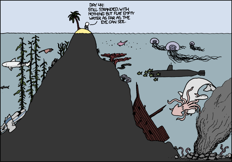
    xkcd: Desert Island.

    …”the most exciting new frontier is charting what’s already here”

     
  • julie 5:55 pm on June 27, 2013 Permalink
    Tags:   

    dataists » A Taxonomy of Data Science 

    5 steps of what a data scientist does, in roughly chronological order: Obtain, Scrub, Explore, Model, and Interpret, by Hilary Mason (bit.ly chief scientist):

    Both within the academy and within tech startups, we’ve been hearing some similar questions lately: Where can I find a good data scientist? What do I need to learn to become a data scientist? Or more succinctly: What is data science?

    We’ve variously heard it said that data science requires some command-line fu for data procurement and preprocessing, or that one needs to know some machine learning or stats, or that one should know how to `look at data’. All of these are partially true, so we thought it would be useful to propose one possible taxonomy — we call it the Snice* taxonomy — of what a data scientist does, in roughly chronological order: Obtain, Scrub, Explore, Model, and iNterpret (or, if you like, OSEMN, which rhymes with possum).

    Different data scientists have different levels of expertise with each of these 5 areas, but ideally a data scientist should be at home with them all. We describe each one of these steps briefly

    Since histograms of real-valued data are contingent on choice of binning, we should remember that they an art project rather than a form of analytics in themselves.

    via dataists » A Taxonomy of Data Science.

     
c
Compose new post
j
Next post/Next comment
k
Previous post/Previous comment
r
Reply
e
Edit
o
Show/Hide comments
t
Go to top
l
Go to login
h
Show/Hide help
shift + esc
Cancel